

This is my weekly post where I highlight beautiful books from my collection. We all judge book covers to some extent (don’t lie, you totally do!) I created this feature to showcase and admire the art and design elements of some of the books I own. If covers didn’t matter, publishers wouldn’t make so many wonderful editions!
What better way to wrap up Austen Month Judging posts with three of my latest editions of Pride and Prejudice!?
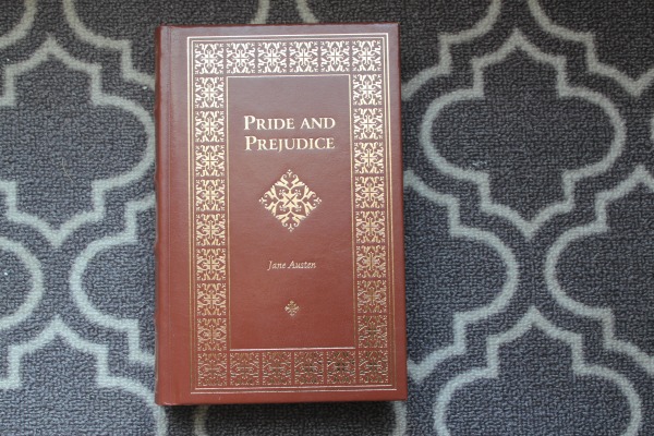
Alas, I hate to report that with these editions, there are no design credits to hand out (that I found printed on the copyright pages anyway), nor is there much in the way of interior design for these copies. I love them all, but you’re probably pretty familiar with my gripe by now – I want the thoughtful and beautiful designs from the covers to be brought to the pages! Why don’t publishers put more effort into chapter headers, drop caps, and illustrations for these special editions!? -sigh-
The pink edition was published in 2019 by Fingerprint Classics, ISBN: 9789387779679 (this edition has the most going for it in terms of interior design features and I at least appreciate some effort was made); the black edition was published in 2018 by Chiltern, ISBN: 9781912714032 (and let me tell you, that paper is thick and smooth and it’s one weighty tome and I love that about it – if it weren’t so pretty it could be used as a damn weapon!); and the brown leather edition was published in 2004 by Dalmation Press, ISBN: 140370919x.


I will never get tired of seeing different editions of Pride and Prejudice!
LikeLiked by 2 people
Haha I’m so glad because I have so damn many and it’s not like I’m gonna stop collecting!
LikeLiked by 1 person