

This is my weekly post where I highlight beautiful books from my collection. We all judge book covers to some extent (don’t lie, you totally do!) I created this feature to showcase and admire the art and design elements of some of the books I own. If covers didn’t matter, publishers wouldn’t make so many wonderful editions!

It wouldn’t be an Austen Month if I didn’t include a Pride and Prejudice Judging post! These are two of my more recent acquisitions. And as I label these blog posts, I wonder why I chose to do so with Roman numerals, because very soon I’m going to have to Google what numbers I need lol.
Sadly the beauty of the exteriors of these two copies don’t extend to the inside – I’m always disappointed when pretty editions don’t have illustrations or at least some chapter art or page detailing. If publishers/designers put this much effort into the cover design, why not go all the way?
But I love these two copies anyway! The blue was published in 2019 by Wordsworth with cover illustration by Claire Shorrock, ISBN: 9781840227932. The black is a Waterstones edition published in 2015, by Penguin Randomhouse with cover illustration and design by Coralie Bickford-Smith, ISBN: 9780241256640.


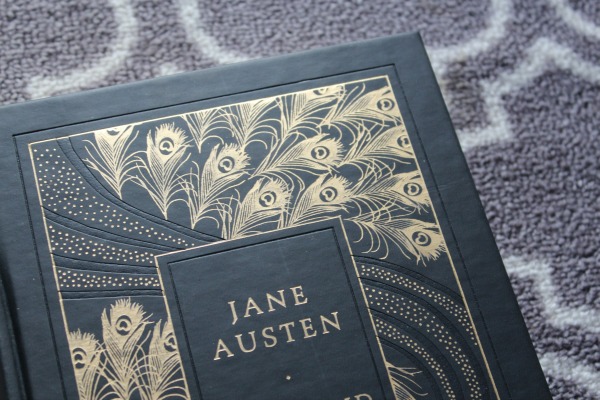


Both very pretty 🙂 Sad to hear they didn’t add the same artsy touch to the inside, but the covers are fantastic nonetheless!
LikeLiked by 1 person
Yes they look great on the shelf!
LikeLiked by 1 person
Interesting that both designs feature peacocks…
LikeLiked by 1 person
Also, P&P XVI was featured at the bottom of the post, and it ALSO has peacock feathers on it!
Is this a thing? Because peacocks are proud, just like Darcy???
LikeLiked by 1 person
^^
LikeLike
Lol that’s a very common theme with P&P art given the pride of the two characters and the general pride of peacocks, I guess.
LikeLiked by 1 person
I like the dark blue one better but both would really make a collection stand out. Just gorgeous! Thank you for sharing! And yeah, those roman numerals do require some research after a while. Haha.
LikeLiked by 1 person
When I started collecting and sharing pictures of my copies, I didn’t realize just how much my collection would grow! The Roman numerals seemed like a cool idea at first haha. But I’m committed now.
LikeLiked by 1 person